Postprocessing | ||
| ||
- Plotting the stress along a path
We are interested in looking at how the stress distribution along the length of the bar changes with time. To do so, we will look at the stress distribution at three different times throughout the course of the analysis.
Create a curve of the variation of the stress in the 3-direction (S33) along the axis of the bar for each of the first three frames of the output database file. To create these plots, you first need to define a straight path along the axis of the bar.
To create a point list path along the center of the bar:
In the Results Tree, double-click Paths.
The Create Path dialog box appears.
Name the path Center. Select Point list as the path type, and click .
The Edit Point List Path dialog box appears.
In the Point Coordinates table, enter the coordinates of the centers of both ends of the bar. The input specifies a path from the first point to the second point, as defined in the global coordinate system of the model.
Note:
If you generated the geometry and mesh using the procedure described earlier, the table entries are 0, 0, 1 and 0, 0, 0. If you used an alternate procedure to generate the bar geometry, you can use the
 tool in the Query toolbar to determine the coordinates of the centers at each end of the bar.
When you have finished, click to close the Edit Point List Path dialog box.
To save X–Y plots of stress along the path at three different times:In the Results Tree, double-click XYData.
The Create XY Data dialog box appears.
Choose Path as the X–Y data source, and click .
The XY Data from Path dialog box appears with the path that you created visible in the list of available paths. If the undeformed model shape is currently displayed, the path you select is highlighted in the plot.
Toggle on Include intersections under Point Locations.
Accept True distance as the selection in the X Values region of the dialog box.
Click in the Y Values region of the dialog box to open the Field Output dialog box.
Select the S33 stress component, and click .
The field output variable in the XY Data from Path dialog box changes to indicate that stress data in the 3-direction (S33) will be created.
Note:
Abaqus/CAE may warn you that the field output variable will not affect the current image. Leave the plot state As is, and click to continue.
Click in the Y Values region of the XY Data from Path dialog box.
In the Step/Frame dialog box that appears, choose frame 1, which is the second of the five recorded frames. (The first frame listed, frame 0, is the base state of the model at the beginning of the step.) Click .
The Y Values region of the XY Data from Path dialog box changes to indicate that data from Step 1, frame 1 will be created.
To save the X–Y data, click .
The Save XY Data As dialog box appears.
Name the X–Y data S33_T1, and click .
S33_T1 appears in the XYData container of the Results Tree.
Repeat Steps 7 through 9 to create X–Y data for frames 2 and 3. Name the data sets S33_T2 and S33_T3, respectively.
To close the XY Data from Path dialog box, click .
To plot the stress curves:
In the XYData container, drag the cursor to select all three X–Y data sets.
Click mouse button 3, and select from the menu that appears.
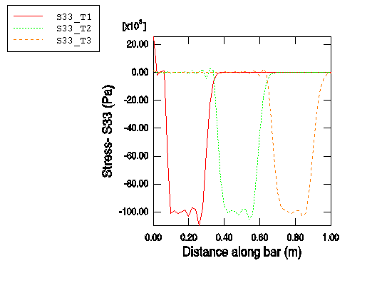
Abaqus/CAE plots the stress in the 3-direction along the center of the bar for frames 1, 2, and 3, corresponding to approximate simulation times of 5 × 10⁻⁵ s, 1 × 10⁻⁴ s, and 1.5 × 10⁻⁴ s, respectively.
Click
 in the prompt area to cancel the current procedure.
To customize the X–Y plot:Double-click the Y-axis.
The Axis Options dialog box appears. The Y Axis is selected.
In the Tick Mode region of the Scale tabbed page, select By increment and specify that the Y-axis major tick marks occur at 20E3 Pa increments.
You can also customize the axis titles.
Switch to the Title tabbed page.
Enter Stress - S33 (Pa) as the Y-axis title.
To edit the X-axis, select the axis label in the X Axis field of the dialog box. In the Title tabbed page of the dialog box, enter Distance along bar (m) as the X-axis title.
Click to close the Axis Options dialog box.
To customize the appearance of the curves in the X–Y plot:In the Visualization toolbox, click
 to open the Curve Options dialog box.
In the Curves field, select S33_T2.
Choose the dotted line style for the S33_T2 curve.
The S33_T2 curve becomes dotted.
Repeat Steps 2 and 3 to make the S33_T3 curve dashed.
Dismiss the Curve Options dialog box.
The customized plot appears in Figure 1. (For clarity, the default grid and legend positions have been changed.)
Figure 1. Stress (S33) along the bar at three different time instances.
We can see that the length of the bar affected by the stress wave is approximately 0.2 m in each of the three curves. This distance should correspond to the distance that the blast wave travels during its time of application, which can be checked by a simple calculation. If the length of the wave front is 0.2 m and the wave speed is 5.15 × 10³ m/s, the time it takes for the wave to travel 0.2 m is 3.88 × 10⁻⁵ s. As expected, this is the duration of the blast load that we applied. The stress wave is not exactly square as it passes along the bar. In particular, there is ringing or oscillation of the stress behind the sudden changes in stress. Linear bulk viscosity, discussed later in this chapter, damps the ringing so that it does not affect the results adversely.
- Creating a history plot
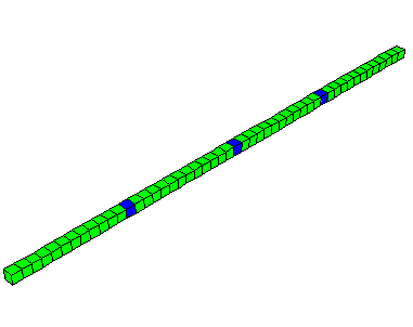
Another way to study the results is to view the time history of stress at three different points within the bar; for example, at distances of 0.25 m, 0.50 m, and 0.75 m from the loaded end of the bar. To do this, we must first determine the labels of the elements located at these positions. An easy way to accomplish this is to query the elements in a display group consisting of the elements along the edge of the bar (set OUT).
To query the element labels:
In the Results Tree, expand the Element Sets container underneath the output database file named Bar.odb. Click mouse button 3 on the set named OUT, and select Replace from the menu that appears.
From the main menu bar, select ; or use the
 tool in the Query toolbar.
In the Query dialog box that appears, click Element.
Click on the elements shaded in Figure 2 (every 13th element along the bar). The element ID (label) appears in the prompt area (and also in the message area). Make note of the element labels for the three shaded elements.
Figure 2. History plot display group.
To plot the stress history:
In the Results Tree, click mouse button 3 on History Output and deselect Group Children from the menu that appears.
Select the data for the three elements you have identified (again, every 13th element). Use Ctrl to select multiple X–Y data sets.
Click mouse button 3, and select from the menu that appears.
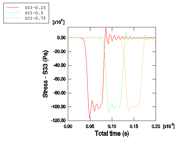
Abaqus/CAE displays an X–Y plot of the longitudinal stress in each element versus time.
Click
 in the prompt area to cancel the current procedure.
As before, you can customize the appearance of the plot.
To customize the X–Y plot:Double-click the X-axis.
The Axis Options dialog box appears.
Switch to the tabbed page.
Specify Total time (s) as the X-axis title.
Click to close the dialog box.
To customize the appearance of the curves in the X–Y plot:In the Visualization toolbox, click
 to open the Curve Options dialog box.
In the Curves field, select the temporary X–Y data label that corresponds to the element closest to the free end of the bar. (Of the elements in this set, this one is affected first by the stress wave.)
Enter S33-0.25 as the curve legend text.
In the Curves field, select the temporary X–Y data label that corresponds to the element in the middle of the bar. (This is the element affected next by the stress wave.)
Specify S33-0.5 as the curve legend text, and change the curve style to dotted.
In the Curves field, select the temporary X–Y data label that corresponds to the element closest to the fixed end of the bar. (This is the element affected last by the stress wave.)
Specify S33-0.75 as the curve legend text, and change the curve style to dashed.
Click to close the dialog box.
The customized plot appears in Figure 3. (For clarity, the default grid and legend positions have been changed.)
Figure 3. Time history of stress (S33) at three points along the length of the bar (0.25 m, 0.5 m, and 0.75 m).
In the history plot we can see that stress at a given point increases as the stress wave travels through the point. Once the stress wave has passed completely through the point, the stress at the point oscillates about zero.